


photo by: http://www.buscemiphotography.com/


Kim and Christian - Grape, Red, Purple and Teal Theme
Custom Pocket Wedding Invitation


Kim and Christian - Grape, Red, Purple and Teal Theme
Program
http://www.buscemiphotography.com/


Kim and Christian - Grape, Red, Purple and Teal Theme
Program
http://www.buscemiphotography.com/


Kim and Christian - Grape, Red, Purple and Teal Theme
Table Numbers
http://www.buscemiphotography.com/


Kim and Christian - Grape, Red, Purple and Teal Theme
Table Numbers
http://www.buscemiphotography.com/


Kim and Christian - Grape, Red, Purple and Teal Theme
Escort Cards
http://www.buscemiphotography.com/


Kim and Christian - Grape, Red, Purple and Teal Theme
Favor tags
http://www.buscemiphotography.com/


Kim and Christian - Grape, Red, Purple and Teal Theme
Well Wish Sign
http://www.buscemiphotography.com/


Kim and Christian - Grape, Red, Purple and Teal Theme
Sweet Table Tent Cards
http://www.buscemiphotography.com/


Kim and Christian - Grape, Red, Purple and Teal Theme
Sweet Table Tent Cards
http://www.buscemiphotography.com/
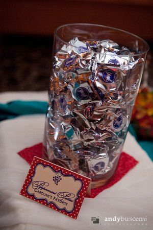

Kim and Christian - Grape, Red, Purple and Teal Theme
Sweet Table Tent Cards
http://www.buscemiphotography.com/


Kim and Christian - Grape, Red, Purple and Teal Theme
Sweet Table Tent Cards
http://www.buscemiphotography.com/


Kim and Christian - Grape, Red, Purple and Teal Theme
Water bottle
Candy Bar
Tic Tac


Kim and Christian - Grape, Red, Purple and Teal Theme
Continental Breakfast Invitation
Rehearsal Dinner Invitation

Kim and Christian - Grape, Red, Purple and Teal Theme
Photo Thank you card
_______________________________________________
Kim and Christian were a fabulous couple we worked with on their custom wedding stationery.
Kim had a very clear vision of what she wanted we had various meetings in our in-home studio and correspondence online that she shared with us all of her ideas. The whole process working with her was a lot of fun!
Since their wedding was taking place at a vineyard in Rochester NY called Casa Larga she wanted to have a grape theme and wanted to incorporate various colors of red, purple and teal which would be carried thought-out the wedding from the stationery to the bridesmaids to the tables.
The design phase began, it was a lot of fun putting her ideas onto paper. Everything came together so well.
As always, we design print, cut and assemble everything in-house. This is something we really believe in so we can work more directly with the client and know what everything looks like before the final pieces hit our clients hand.
We first started out with their Save-the-Date magnet which incorporated their picture and colors. Then we worked on their Custom Wedding Invitation which was a pocket, with 3 inserts, band/tag and 2 layer invite this was a fun piece to design for it really set the tone for what the rest of the stationery was going to look like.
For the pre-wedding/post wedding invitations we created both her
Rehearsal Dinner Invitation and Continental Breakfast Invitation. The Rehearsal Dinner Invitation was layered with pearl paper and we used the grape motif the Continental Breakfast Invitation also had the same motif however we rounded the corners of the invitation per our clients direction to give it a unique look.
The program we designed was Tea-Length, layered and folded it was such a beautiful fun piece that really tied everything together.
Table Numbers, Escort Cards, Favor tags were all flat layered pieces and were all coordinating to the table colors.
We made signage for the Sweet Table which is a pretty cute story - they had all of their bridesmaids/groomsmen tell them their favorite candy and then I made tent cards that indicated whom liked what...it was a very cute personal way to inappropriate their wedding party.
They had hotel thank you baskets for their guests staying at the hotel they reserved. We designed a coordinating thank you note for the gift basket as well as coordinating Water bottle, Candy Bar, Tic Tacs. They incorporated other goodies as well within the baskets.
Then to complete the set we designed their Photo Thank you card which had their picture as well as the grape.
Above are photos of our work...a special thank you to http://www.buscemiphotography.com/ for providing us some pictures.
We were so very happy with the results of Kim/Christians Custom Wedding Stationery!
Let us know what you think...
xoxo
~Samantha


